Monday, November 21, 2011

Nominal Area Choropleth

https://blogger.googleusercontent.com/img/b/R29vZ2xl/AVvXsEidkHo8rdXWlUuZxLrvFYeKInxZfx1De3iWmKH4Oz5GN98rjge23uc4Rn6xvogAUFEtcKsAv8Zc23J2tUlxrbDyjRusOUO4LUuVpP9TKrcKkLOh5Ds2hkkzdnDJ9hOtgAZJE2F3GbeS9ac/s400/2choropleth.jpg
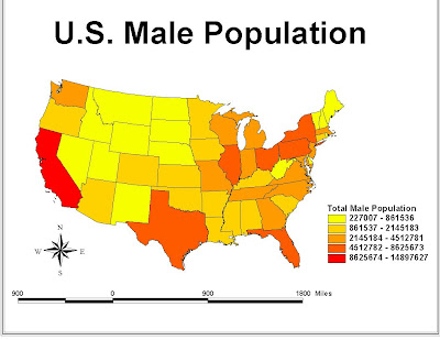
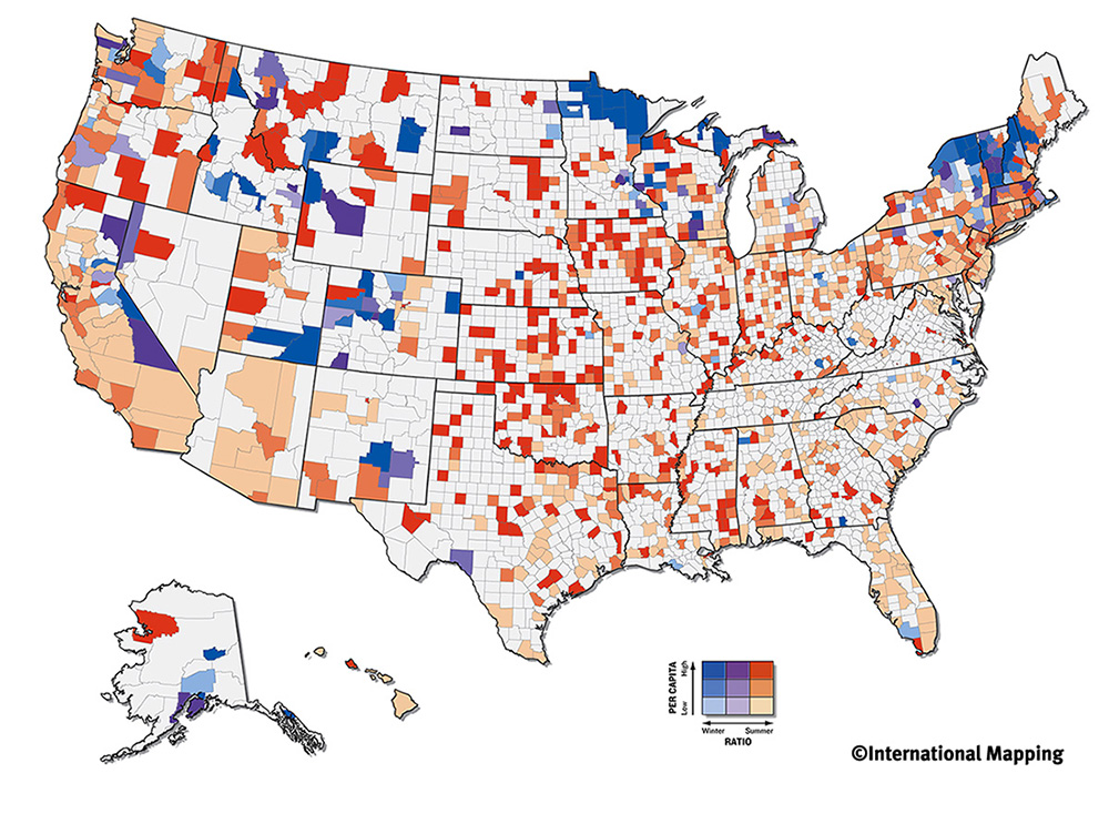
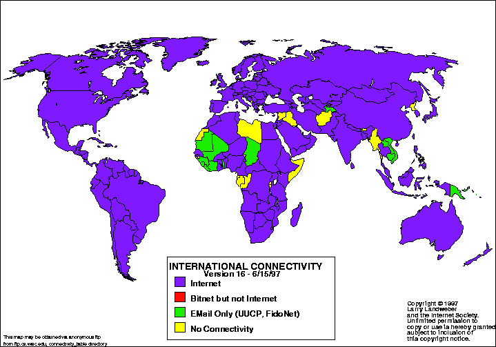
Like all choropleth maps a nominal area cholorpleth map displays data by use of color. however with a nominal area map there is no implicit reason the data is compiled in one manner or the other. This map shows a nominal area chorpleth map related to male population.

DOQQ

http://casoilresource.lawr.ucdavis.edu/drupal/files/images/drg_vs_doq-forrest.preview.png

Digital Orthophoto  Quarter Quads, or DOQQ for short, combines the artistic visuals of a photo and uses geometry to section of quadrant within the map.

DLG

http://www.manmapping.com/seminar/dlg.gif
A DLG or Digital Line Graph is a technological representation of a given area using lines to present specific data point. Much like the other computer based mapping techniques DLG is a somewhat new technique for mapping graphical data.

DRG

http://egsc.usgs.gov/isb/pubs/factsheets/fs08801.graphics/drg.jpg
 A DRG or Digist Raster Graph is a scanned image of a topographical map that has been converted into data. This is a scanned map of Washington DC.

DEM

http://www.sciencegl.com/gis_dem/map_dem_gis_3d_b.jpg A DEM map, or Digital Elevation Model, is a three dimesion techonological rendering of a given area's elevation.

Classed Choropleth Map

http://www.esds.ac.uk/international/images/italyim.gif

The objective of a classed choropleth map is to determine the height, color, and intesnsity of a given area through the use of color and a bar to guide the viewer.

Hypsometric maps

http://www.public.asu.edu/~arrows/pamir/hypso.jpeg
A hysometric map is a map that measures eleveation by utilizing a topogrphical surveying technique and contour lines.

Parallel coordinate graph

http://www.secviz.org/files/images/fw_parallel_coords_selected.preview.JPG
 A paralle coordinate graph is a way to visualize high dimension geometry. Using a series of point and lines to graphically represent data.This particular graph reprents select firewall coordinates.

Star Plot

http://itl.nist.gov/div898/handbook/eda/section3/gif/starplot.gif
A star plot is used to examine relative values of a single data point. The other points vary depending on the single data point. This star plot represents 16 different automobile the larger the plot the more variables are associated with that particular car.

Correlation Matrix

http://www.emeraldinsight.com/content_images/fig/0800200602005.png
A correlation matrix is a mathematical representation of how two data point correlate to each other.

Similarity matrix

http://img.springerimages.com/Images/Springer/PUB=Springer_Japan-Japan/JOU=11284/VOL=2008.23/ISU=1/ART=2007_353/MediaObjects/WATER_11284_2007_353_Fig4_HTML.jpgA similarity matrix is a mathematical graph that is used to show the similarity between two sets of data at a given point.

Isopleth

http://nature.berkeley.edu/~alyons/locoh/img4_isopleths.gifAn isopleth map is a general representation using line to segment a given area. An isopleth uses contour lines to graphically visualize the area that is being mapped.

Box Plot

http://www.netmba.com/images/statistics/plot/box/boxplot.gif
A box plot, also referred to as a box and whisker plot, is a convient way of visually representing a group of five numerical values. The box is form with the largest and smallest number and then cut in the median number into three quartiles, each representing a given figure.

Index Value

http://www.zealllc.com/c2002/Zeal020802D.gif
An index value plot is a line graphical representation that usually deal with performance of a product in terms of a yearly period. For example this map graph the perfromance of various stocks from the year 2001 to 2002. Index value plots are commonly used in the stock market and other economical figures.

Standardized choropleth maps

http://www.directionsmag.com/images/newsletter/2004/12_15/Figure2_lg.gif
Another form of choropleth mapping. Standardized choropleth mapping uses one data and then uses colour to differentiate the different areas of the map.

Range Graded Proportional Circle Map

https://blogger.googleusercontent.com/img/b/R29vZ2xl/AVvXsEgC7KGlTfLV1QolVUPFTDcsk7knuPLwke5CdL6lCd9b8MmALfi0IVZyAsBX5fAJbwqN7PYeoyz66nJBCyBr5tcI2ZoqTf6QTJtvDDEmU1G2F53bx5M3XkEG4LEjgljBbDXR2912b4Wr734Q/s320/Range_graded_proportional_circle_map.pngA Range Graded Proportional Circle Map is a map that uses circles based on their size to correlate directly to the data given in the key.

Continuously variable proportional circle map

https://blogger.googleusercontent.com/img/b/R29vZ2xl/AVvXsEjYpjO24SLcrhuUFv8yW_1611Zh3gCc-uuVvr6pGzKeexG5z-NdYYIEThBgDWlWuFx8n_0doGCyKk6JZsVqrOghGn4Jgv-z35kvR-_MK64A3ZJ6LqCdTIx0laDHSWjgbU8rM-WTER3zhBIz/s1600/Map+19.gif
A continuously variable proportional circle map is a proportional circle map which uses circles to create  data, then scales it to the specific data. The circles are in proportion to the idea being measured.

Cartographic Animation

https://blogger.googleusercontent.com/img/b/R29vZ2xl/AVvXsEiPxPHmKyN_ma1C6etTEF_AO_zwvHD-i11aTSMhhkmj7sHkGtQ_40fjt-pUmMOBJa_IT11JqWgkxiTWyXPtzf_Xi10MK8CPxQ9_Vz7R15XrEAVR-5PHQivh1tf-gNfBgBTPX1GpX-2M-ic/s1600/Cartographic+Animation+Maps.pngA cartographic animation is literally a time sequence representation of a given object or area, It provides a visual picture of a hurrican in a given time period, in the above photo.

Infrared Aerial Photo

https://blogger.googleusercontent.com/img/b/R29vZ2xl/AVvXsEiUmWXQUnhL1g3ngfqr2mCKavSgzbmHiF-hUmYLcQSofTXmWy9muXtfoPY2Ew0hRjayF7nNXhSHcVmIHJg9uDyXsORXen5j9kSt3HriiFNuViYqCBN3wG-614KsJRVST0ByEZRm07Is0Ca2/s1600/aerial+infrared.jpg
An infrared aerial photo is a picture  that measure the heat rising from a given area. Infrared measure the radition of a give wavelength and thus provides a visual representation, in this photo, of a forest and the heat coming off it.

Black and White Aerial Phote

https://blogger.googleusercontent.com/img/b/R29vZ2xl/AVvXsEhPgKdCjzMs0KJdpZzI6owQmzahDk85YOclzWXh4qCHakIkqnemFhSV3U3kzvME6Xv896ttixx4y46ELNtd82sgoP-8JkMq7YGhxoNg6HyEZgKXx6PweYV1pSke3-fIsjj6O6LqsgtUPoYM/s1600/black_and_white_aerial_photograph_of_kc.jpeg
A black and white aerial photo is a visual representation of a given area from a birds eye view. The photo is a true scale of an overpass shot in black and white. A photo is a map of a certain time period, and therefore can be used to comprise data at a certain time.

Stem and Lead Plot

http://www.eduplace.com/math/mhm/5/06a/ts_5_6a_wi-1.gif
A stem and leaf plot is a statistical tool used to graphical display a set of data. It is somewhat confusing, but easy to understand once it is explained. For example in this graph we see that is represents the age of people at a family reunion. One takes the stem number and then accompanies it with the leaf, ie in this case looking at the first row there was a one year old, eight year old, and nine year old at the family reunion.

Population Profile

http://www.ifad.org/operations/regional/pf/figure1.gif
A population profile is a vertical representation of a given population with regard to one variable. The example map is a population distrubuted by age with and without the variable, in this case AIDS.

Proportional circle maps

https://blogger.googleusercontent.com/img/b/R29vZ2xl/AVvXsEgREnRZgF5C-u5CAp24i3zFLbsqRK-6_2aLpvNbZ1loHRV5hHcFQHrWPgHrBcjkTD3cq8OvwiA9JwNFGsnsXAFp26GnY1gWzhyMdJUDQyL4Mf37yrVFx0IGa7qfwNeGK0kOR8GHgwuIL2o/s1600/circle.jpg

A proportional circle map is a graphic representation of a set of data that uses the size of the circle to indicate the size of the numerical value. the larger the circle the larger the number within the data set. The example above is the Mexican population of the western USA in the year 1990.

Choropleth Map

http://my.ilstu.edu/~jrcarter/Geo204/Choro/Tom/hispanic_race_fl-H1_FINAL.gif
A chorpleth map is a thematic map that uses colour to represent a given data set. This example measure the percentage of Hispanic or Latino population in southern Florida during the 2000 census.

Univariate Choropleth Map

https://blogger.googleusercontent.com/img/b/R29vZ2xl/AVvXsEhUiNGs1WMuzZ7IiOHajpNoNNNWQj58nlmIw7CPvGp0bXZXWhEuL5hdUSN9ZvM4_Z2Pvxyp20exEyGXu6CWgOSZslxf2Q8nKHiNSwjGYf4NWPwjUp7wGcQQ0ILMn5DYm9frU41OMe6ws9A/s1600/univariate.pngA univariate choropleth map is vaery similar to a bivariate choropleth map in that it uses color to show the realtionship of data, however in a univariate map deals only with one variable, and in the example this one variable is income differences between the different states.

Bivariate Chloropleth Map

http://www.directionsmag.com/images/articles/sportsillustrated/Olympic_Athletes.jpg
A Bivariate Chlorpleth map is a simple map that uses colour to display two distinct occurances within a given area. This exaple displaces the per capita rate of Olympic Athletes within a given state and correlates it to a ratio between the population of Olympic Athletes within the population and the general population.

Unclassed Chloropleth Map

https://blogger.googleusercontent.com/img/b/R29vZ2xl/AVvXsEjiGWz6ZCQwpLhQemXCgGPfLtYZI3rt95kyI13BdoaXo3b2D0lmUKdcY5Xo9oRevsxB-Szltj9e71_U1Ky9L4xWC7jhoEVsLgHRt5qwg6qKjMfbOdez6cdptpZ-3i3zQUGasqXPhcFVbsY/s1600/uchoropleth.gif
A Unclassed Chloropleth map uses color to simplify a set of numerical data. These maps are an awesome way to allow the data to speak for itself through a difference in color.

Histogram

http://www.vertex42.com/ExcelArticles/mc/Images/ScreenCaptures/SalesForecast-Histogram.gif
A histogram is a graphic depiction of data with relation to two factors. In the example is a sales projection for a company, that shows the number of bins sold and the frequency that number was sold.

Windrose

http://www.mathworks.com/matlabcentral/fx_files/17748/5/wind_rose.png
A windrose is a weather map that shows the intesity and direction of the wind at a given time. This windrose shows the intesity through the use of color.

Scatterplot

http://itl.nist.gov/div898/handbook/eda/gif/scatterp.gif
A scatter plot is a mathematical deptiction of the relationship between two sets of data. The more point that are located with one area indicates that the data is closely related at that given point. This scatter plot shows that in field and in lab reading of crack sizes are related in at differents points.

Lorenz Curve

https://blogger.googleusercontent.com/img/b/R29vZ2xl/AVvXsEjAF9PvAE2EebUyJGp6m8PsTX62Yt3ZO4LLbGRKnvWgM0yZhvoTLKCs3WXGd1r3pVFoQakqm2wFpoewTXNP3kX1zu_A-CCjNHn6ZsDlpFV747szSZ6vVnasESnQbcvmK1GOEPXNclw7OCz-/s1600/Figure6.5.gif
A Lorenz curve is an economic map that conveys the equality or inequality between wealth. This example depicts the amount of income percent and the percent of household that hold that income, thus in this graph the Lorenz curve is inequal.

Bilateral Graph

https://blogger.googleusercontent.com/img/b/R29vZ2xl/AVvXsEj0EK6RnIBnMfcVF6iqaIn8vu9m9teQQkTIDtELcPy7NwitFN4zZmg5ouMrVN7b76_mWfqvuJ32KoK87JjgkxxB3KJSBpLHli2EwhyufYUxPWHplGxIasyT6mt9CkB_gAaLEarxXMnsBw7m/s1600/bilateral.gif
A bilateral map is a graph that displays opposite information by use of bars/ This bilateral graph show the improvement of adult with hearing aid placed in their left, right, or both ears. It conveys the data using bars and colors to depict information and compare that imformation to the others within a given time period.

Lidar

http://www.lidarbasemaps.org/imageJ002.jpg
A LIDAR, light detection and ranging, is a technology based map that uses light to determine the distance between two points.  It is a remote optic sensor that conveys distance or some other property and by use of cmputer sofware renders a map. This LIDAR image was used to display the layout of the land in a US location.

Cartogram

http://www.worldmapper.org/images/smaller_png/2.png
A cartogram is a map in which an area is skewed to match a certain criteria. The size of the area is scale to the amount or percentage of that criteria is covers. This cartogram is one depicting world population, the areas are sized depending on how densly populated that portion of the world has become.

Triangular plot

https://blogger.googleusercontent.com/img/b/R29vZ2xl/AVvXsEgy6RGGiKDDd7527JD9bU1r5VoW6VRi9hHX47IdZ80BELQXtoCsoCxGrCt0D1yQIBRHC09z-TFlVjF_1UcVDRQ10IHWG-xNBiPjd0i6OiHqdN8Zwp6BWtoG86DSLAdfcjMSFtnwbZwqltDC/s1600/triangle.png
A triangular plot is a specific type of map used to convey three ideas within a given format. For example this plot compares the voting percentages of Liberal, Conservative, and Labour votes. Using the plot one can decipher how the three groups vote and what percentage of them vote.

Isopach

https://blogger.googleusercontent.com/img/b/R29vZ2xl/AVvXsEh14C4eF8KDsP1CLOMa2LuHQXGEhz_4EyInBtMlozK9Kt6voQz38ST0yAYSOoBZh52yYhZh8xAqTH32sp6vI9cBoAgDcD-Ry68uNLUfzu33o0WQzfTx5i8TUDNokQBKvgTJerqGgLYTRMs/s400/Isopach.jpg
An isopach is a map that uses a set of lines to indicate areas that have equal thickness. This is an isopach of the quality of sandstone within a given area. The connecting lins and colours are used to indicated the different thickness of the land.

Isohyet

https://blogger.googleusercontent.com/img/b/R29vZ2xl/AVvXsEiMHKJJSa44YpDd5eYjSoqaFliN7BHqf3vYDlcF_PKSZW_9kAWBju0k4NIZYnVKdflB94k8D5LJsWWMXGG3Mv3C3J-NiB-tFPuhxUk9lNz-SkMhLBjImALbX5zf-Y7iQa9EUEqXYv2aX5s/s1600/IsohyetMap.GIF
An isohyet is a special isoline map used to measure rainfall within a given area. This type of map uses lines and point to connect areas with an equal values of rainfall. This is a isohyet of Africa, and uses color as a way to indicate the difference in rainfall within the given lines.

Isotach

http://www.erh.noaa.gov/btv/events/28Oct2008/300mb_isotachs_28_18z.gif

An isotach is a particular form of an isoline mape used to measure windspeed. The point along the circles are equal to the same windspeed. In this map it measures the windspeed within United States. This map also adds colour as a way to show where the winds are most severe.

Isobar

http://www.newmediastudio.org/DataDiscovery/Hurr_ED_Center/Hurr_Structure_Energetics/Closed_Isobars/Closed_Isobars_fig02.jpg
An isobar is a specic type of isoline map mainly used in wether to indicate pressure within a given area. each circle is formed by a set of points where the pressure is equal. This is an isobar of the pressure in the northeast and midwestern portions of the United States.

Isoline Map

http://www.sonoma.edu/users/f/freidel/remote/rstopo.gif

An isoline map is a map that uses continous lines to indicate equal values to every point on the line. These are commonly used to measure altitudes in an area. This map shows the altitude of a volcanic crater, with each isoline indicating the same altitude.

Doppler Radar

http://kwilklab.files.wordpress.com/2011/04/doppler_radar.gif
 Doppler radar is a map tracking severe weather, mainly precipitation, using technology. Doppler radar uses a color scheme over layed on a map to display the areas under the most threat from sever weather. For example, this radar is a tracking of a hurricane during its landfall in Florida.

Statistical Map

http://personalpages.manchester.ac.uk/staff/m.dodge/cybergeography/atlas/landweber_version_16.gif
A statistical map is a way to graphical quantify a specific topic with regard to a given area. This is a statistical map of internet connectivity throughout the known world. It uses color as a way to quantify the differences in each region with regard to internet connectivity.

Propaganda Map

https://blogger.googleusercontent.com/img/b/R29vZ2xl/AVvXsEijnvskBktpY2ysVvMgNNIDUr756ybb1PSVFE4uGVeu3DXK8lWZH728sfS13NZT1fR0sapNjDNj6eEa4nxzHjONrazUOWnR7RaNCNk14PzA88T63nYWTh5Lc4uNewlCTSEnEWobttNXS4rB/s1600/Propaganda+map.jpeg
A propaganda map is a map used to persuda the viewer to a certain viewpoint about a particular subject. This map for exaple is a propaganda map because it is meant to persuade the viewer to see what the Nazi policy of WWII was with regard to acquiring land. Propaganda maps are a form of persuasive cartography that influences the viewer.

Climograph

http://wps.prenhall.com/wps/media/objects/214/219557/climograph2_national_drought%20_mitigation_center.gif

 This is a climograph. A climograph details the average monthly temperature and precipitation in a graphical way. It shows what month was had the most precipitation and what month had the hottest tempatures. This particular climograph was used to measure the drought within a certain area of the country.

Flow Map

http://www.nhcs.k12.nc.us/ogden/images/FlowMapdemo.jpg
This is a flow map of how to make a peanut butter sandwich. A flow map, or flow chart as sometimes referred is a set of steps with a pattern beginning and ending in a definite manner. Flow maps can be very useful for writers because it provides them a way to generalize the events within a story without  making a super detailed list.

Cadastral Map

http://en.wikipedia.org/wiki/File:Pielnia_1852.jpg
This is a Cadastral map of a village in Austria circa 1852. This type of map shows the boundaries of the land parcels and is used as a register of who owns the land. It provides a detailed borders for each parcel, that way the owner and government can know exactly where their land begins and ends.

Thematic Map

https://blogger.googleusercontent.com/img/b/R29vZ2xl/AVvXsEhVFqPHXDJ1_GynBDcFAJePzcfKOssgAn-kl7LXO-ewVNRrl_AqWKE5-LlLbF6Jh4iFlOeOd0oDLHSdW7ZDMM0QBgP6hapVD3xYUrxxuP3YuzIBt3_Or4Ehxq25AoGDsWq2uoKIya9Z4kw/s1600/stpop96.GIF
This is a thematic map of the United States displaying the population change from 1990-1996. It qualifies as a thematic map because it deals with a certain theme. in this case population, and uses colors as a way to differentiate the theme in the various states.

Topographical Map

http://www.brazadv.com/brazil-map/relief.jpg
This is a topographical map of Brazil. It qualifies as one because it uses both verical and horizontal dimensions to determine the relief of the map. it display both cities and elevations of Brazil.

Planimetric Map

https://blogger.googleusercontent.com/img/b/R29vZ2xl/AVvXsEipkkXYObayKfILxgz_ld7u4yCwNXoUVvnN6fm8cJ4ajbJkqjcJTDb-eyJmVsVk4lYZ7tC2Hrylp4ibZAp6ke2fZ2PDvCRJynFNsKg37n51Sv0y-tZk_pmoUHyQG8D4-nGhV-FFjhp7kHI/s320/Icelan_Pol2.jpgThis is a planimetric map of Iceland. The reason it is a planemetric map is that it shows the horizontal distance between the cities with little regard to elevation. It displays many cities and can be used to determine distance.

Mental Map

https://blogger.googleusercontent.com/img/b/R29vZ2xl/AVvXsEiD1_5Vouitu1HivfEa-7ARzj7ZaANQUJ8-dH8aBCvdCwk80ig9ex8N0xMBf_lgqFd78ZQtXX0IkpmaCcXpOSe1T5Q0tBHrEBq-weagz7XIpfjaIqgpZZjdymGSu4ZLWN-CJ9Fyrt7KoQwe/

The map is a mental map of how architecture is percieved by those who view it. Dr. Donna Wheetley developed this mental map as a way of showing inhabitants, cliens, and other architects how different factors play into the design of a building. This is a mental map because it showcases a person's thoughts and provides a path in which to interpret said thoughts.